
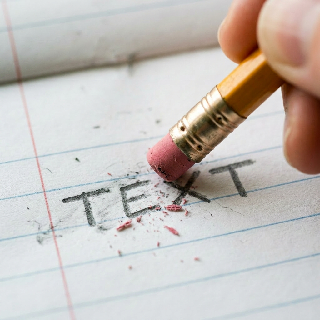
There is a special kind of panic that happens when someone opens a slide deck and the first slide has twelve bullet points, three paragraphs, two screenshots, a footnote, and a quote in 9 point font.
That is not a slide.
That is a cry for help with a title.
Text on slides can be useful. Text can guide attention, label an idea, reinforce a key phrase, or give people something simple to remember. But when a slide has too much text, the audience stops listening and starts reading. Or worse, they stop doing both and begin wondering what snacks are left in the break room.
The problem is not text itself. The problem is asking text to do too many jobs.
A slide should not be the script, the handout, the policy document, the speaker notes, the legal archive, and the emergency backup plan all at once. When everything goes on the slide, nothing stands out.
That is where attention goes to die.
A good slide gives people a place to look without making them work too hard. A few words can be powerful. A short phrase can stick. A single question can pull people in. A clean label can help them understand what they are seeing.
But a wall of text? That just turns the presenter into background noise.
And then comes the worst move of all: reading the slide out loud.
If the slide already says everything, why is anyone in the room? We can all read silently at different speeds like adults in a library. Reading every bullet word for word is how you make five minutes feel like a layover in a windowless airport terminal.
The real question is simple:
What text actually needs to be on the slide?
Not what could be there.
- Not what someone might possibly need someday.
- Not what makes the slide feel “complete.”
What needs to be there to help the audience understand the idea in that moment?
Usually, it is less than we think.
A title should do some work. “Policy Update” is technically a title, but it does not help much. “What Changed for New Requests” is better. It tells people what to pay attention to.
Bullet points should be trimmed until they stop sounding like committee minutes. If a bullet wraps onto three lines, it is probably not a bullet anymore. It is a paragraph wearing a tiny, ugly disguise.
Full sentences are not always bad, but they should earn their place. Sometimes one strong sentence is better than six weak fragments. Sometimes three words are enough. Sometimes the best text on the slide is just a number, a question, or a label.
And please, let us retire the slide that says:
“Objectives”
followed by seven bullet points that all begin with “Understand.”
Nobody has ever walked into a room hoping to behold a dense objectives slide. Say what people are going to learn in plain language. Better yet, make it specific. “By the end, you can submit a clean request the first time” is more useful than “Understand submission guidelines.”
Text should make the slide easier to use, not harder to survive.
There is also no prize for using every inch of white space. Empty space is not wasted space. It is breathing room. It helps the few words that matter actually matter. A slide with one clear phrase can feel confident. A slide crammed with text feels like it packed for a weekend trip using seventeen suitcases and a laundry basket.
The best slides are not empty. They are purposeful.
That is the difference.
Edited text means someone made choices. Someone decided what mattered most. Someone cut the sentence that was technically accurate but deeply unnecessary. Someone moved the extra detail into speaker notes, a handout, a follow up resource, or literally anywhere else besides the slide.
Because slides are for the moment.
They are not where every detail has to live forever.
So before adding more text to a slide, ask:
- Does this help the audience follow the point?
- Will they be able to read it quickly?
- Is this better as a visual, a spoken explanation, or a separate resource?
- Can I cut this in half?
- Can I cut it in half again without losing the meaning?
Your slide does not need to say everything.
It needs to say the right thing.
